What 60–30–10 means
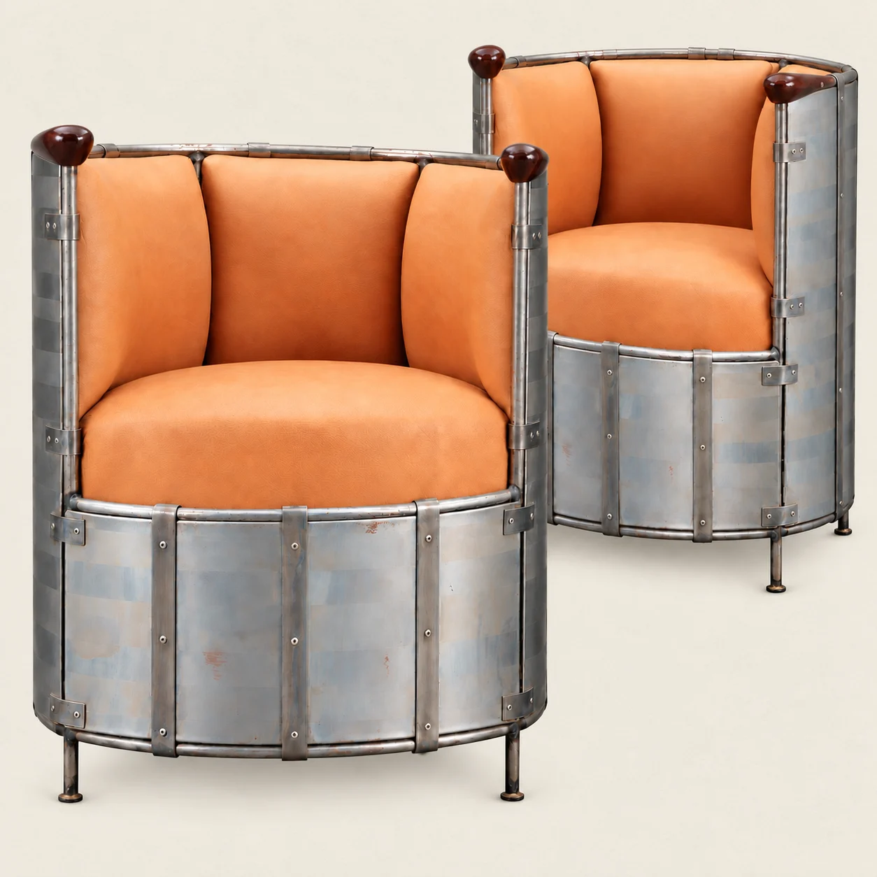
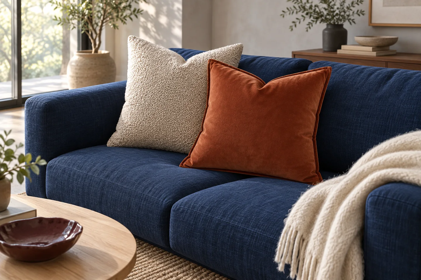
Think of the room in three broad parts: about 60% in a main color, 30% in a supporting color and 10% in an accent. The main color often comes from walls, a large rug or curtains. A sofa, bedding or a group of wooden pieces can supply the second. Cushions, artwork and smaller objects carry the accent.
These are rough visual proportions. You do not need to measure every surface or buy exactly three colors. A pale oak floor, a cream wall and oatmeal linen can sit together in the background; small details in black or metal can remain. Stand in the doorway and look for a clear order: one color leads, another supports it, and a few details catch your eye.
Start with the things that will stay
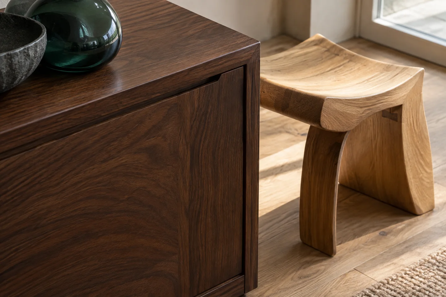
Before choosing paint, look at your floor, sofa, cabinetry and any rug or artwork you want to keep. Take one color from those pieces as the starting point. If a blue sofa already dominates the room, give it the supporting role and try a quieter main color around it. A room with dark wood can use that brown as part of the palette instead of adding another large area of color.
Choose the accent last. Try a folded blanket or a book jacket in that color before buying anything. Repeat it in two or three places if that helps connect the room. A bright or very dark accent can draw attention even when it occupies less than 10%.
The Valenne shortlist
Build the palette in small pieces.
Try one accent against your existing upholstery before buying a whole set. These pieces offer rust, amber and muted neutrals.
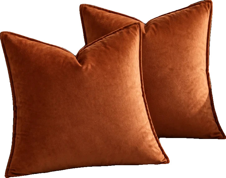
Rust; 18 x 18 inches; pack of 2 covers, inserts not included
Rust velvet brings a concentrated warm accent to grey, cream or dark upholstery.
Before you choose Covers only; check the pack contents and insert size on the selected listing.
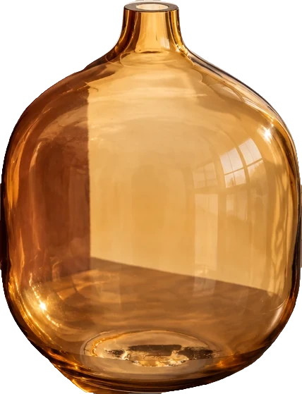
Amber; 7 inches diameter x 8.25 inches height
Amber glass repeats a warm accent while allowing light to pass through the arrangement.
Before you choose Check the opening and base against your stems and shelf depth; glass colour changes with the light.
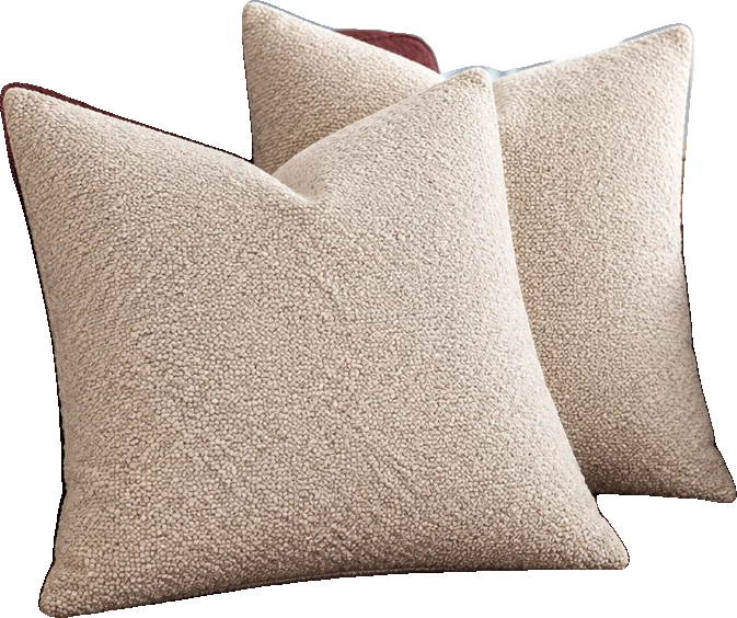
Beige / Natural Beige; 20 x 20 inches; pack of 2 covers, inserts not included
Beige bouclé adds texture while keeping the palette quiet beside a stronger print or colour.
Before you choose Covers only. Confirm the 20 × 20 in variant and the care instructions before ordering.
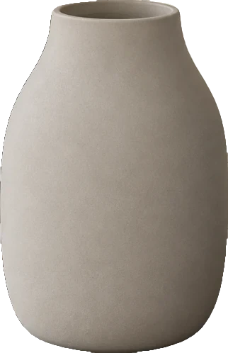
COLORA; Mourning Dove (light brown / grey)
A small, muted porcelain vase adds a softer surface beside glossy glass or metal.
Before you choose Confirm the selected size on the linked listing; the listing contains differing dimension descriptions.
01 / Cream, olive & rust
Cream on the walls, curtains and rug makes a soft background. An olive sofa gives the room a definite color; rust in the cushions and throw brings a warmer note. Wood and woven textures sit comfortably beside all three.
If your sofa is cream, move the olive to curtains or a substantial rug. Keep the rust in smaller textiles so the combination is easy to adjust. The swatches below are suggested starting colors, rather than paint matches or measurements of the room.
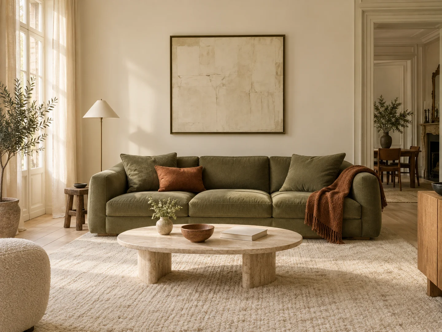
60% Cream
#E8DFCEWalls, curtains & rug
30% Olive
#656B4FSofa or larger textiles
10% Rust
#A45237Cushions & a throw
02 / Cream, blue & ochre
A deep blue sofa gives a cream room more contrast. Repeat a little blue in a print or blanket, then bring ochre into a cushion and artwork. Pale wood keeps the large furniture from feeling too heavy.
The blue does not have to be navy. A grayer blue is an easier starting point if the room receives cool daylight. Compare it with your chosen cream in the actual space.
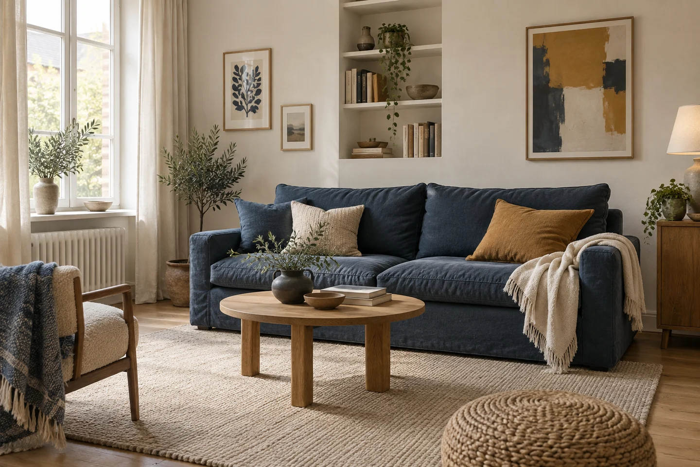
60% Cream
#E9E2D5Walls, curtains & rug
30% Blue
#344C60Sofa & repeated textiles
10% Ochre
#B98735Cushion & artwork
03 / Sage, wood & burgundy
The main color can be green. Here, pale sage walls and bedding surround a group of warm wooden pieces. Burgundy appears in a throw, cushion and small bedside details. Cream curtains and lampshades soften the transitions.
Treat the wood swatch as a guide to warmth, not an exact stain. The grain naturally contains several browns. Keep the burgundy textile easy to remove while you decide how much depth you want beside the green.
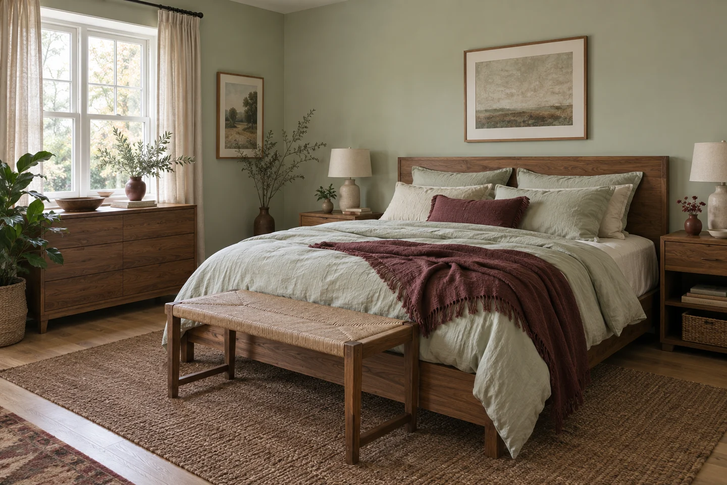
60% Sage
#D9DFD2Walls & bedding
30% Warm wood
#9A7354Furniture & wood tones
10% Burgundy
#773F45Throw & small details
Test the palette in your light
Put physical paint and fabric samples beside the furniture they will meet. Look in daylight and again with your usual evening lamps on. A cream can look yellow beside a cool white; a muted green may seem grayer in a shaded corner. Screen colors and hex codes are useful for planning, but they cannot tell you how paint or fabric will look at home.
Take a photograph from the doorway after trying a few samples or rearranging textiles. If everything competes, reduce one of the stronger colors. If the room feels too flat, try a darker value or a different texture within the same palette. Adjust the balance until it suits the room; 60–30–10 is a starting point you can change.