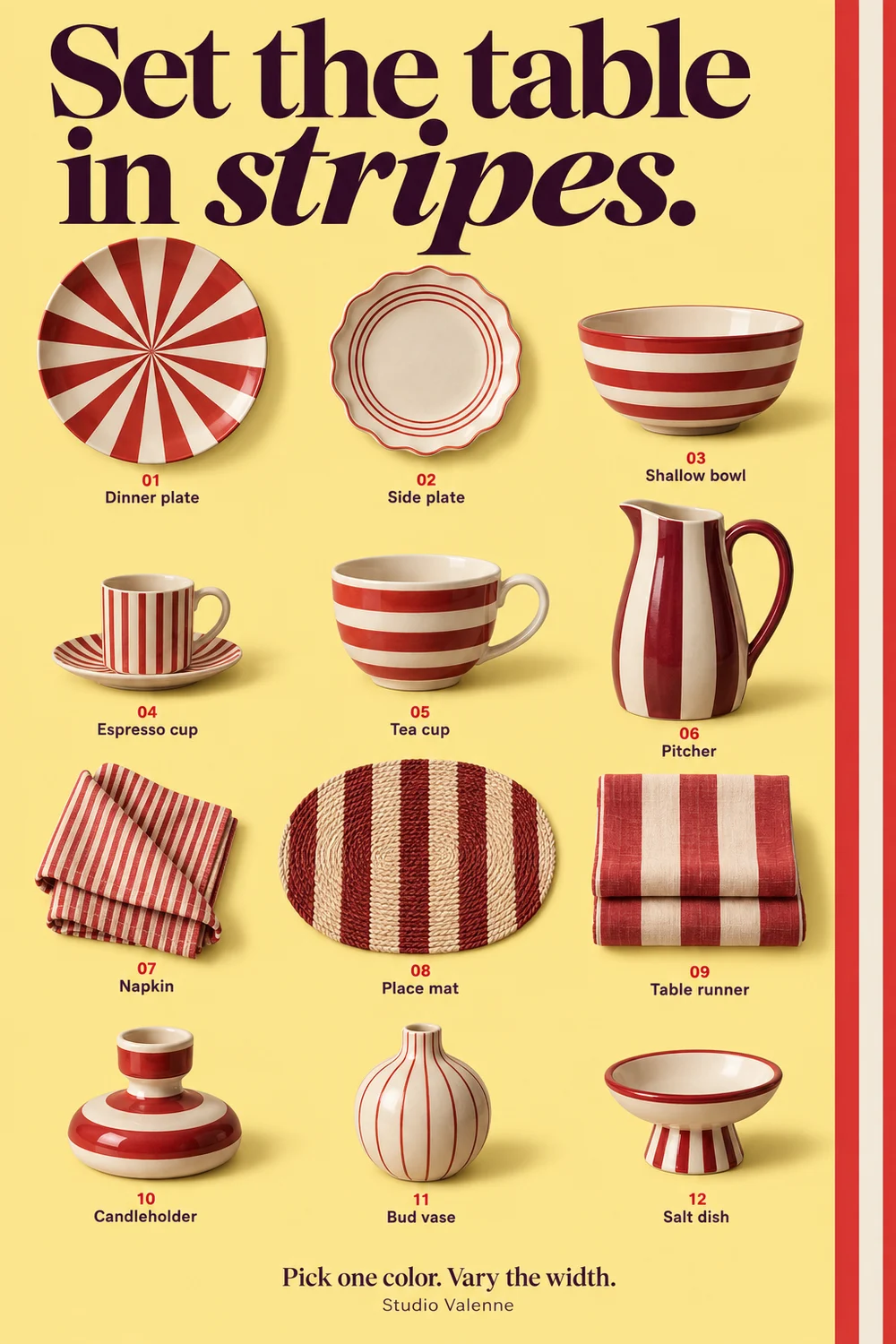
Set the table in stripes
Start with one piece you already use: a red-striped plate, a checked napkin or a plain cream bowl. Choose one color to repeat across the other pieces, then vary the width or shape of the pattern.
In this twelve-piece concept collection, broad bands sit beside fine lines and narrow rings. The shared red-and-cream palette keeps them connected, while woven linen and glazed ceramics reflect light differently.
Use the poster as a comparison sheet, not a list of items to buy together. One patterned plate with plain tableware can be enough; a runner or napkin is another way to try the idea with what you own.
Borrow a small colour from the print
In the illustrated example, the small blue petals in a larger ochre-and-oxblood botanical print supply the colour for a medium check and a plain velvet. The repeats differ in scale and the velvet offers a break from pattern.
Use actual samples at a comparable size. A tiny online thumbnail can disguise the scale of a large motif. Check the pattern repeat, fibre, intended use and care instructions before ordering upholstery fabric. The illustration is an original textile concept, not a Svenskt Tenn fabric or a purchasable matching set.
The Valenne shortlist
One stripe. One quiet texture.
The striped throw supplies the large pattern; a plain textured cushion gives the eye somewhere to rest.
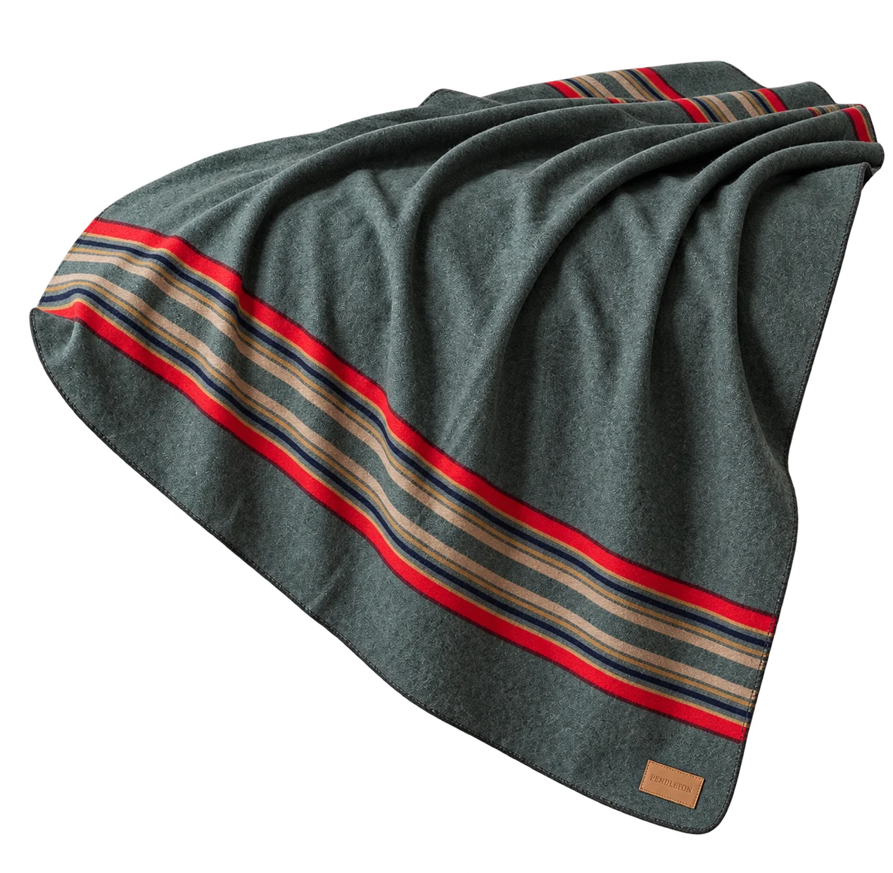
Green Heather · 54 × 66 in · 86% virgin wool, 14% cotton
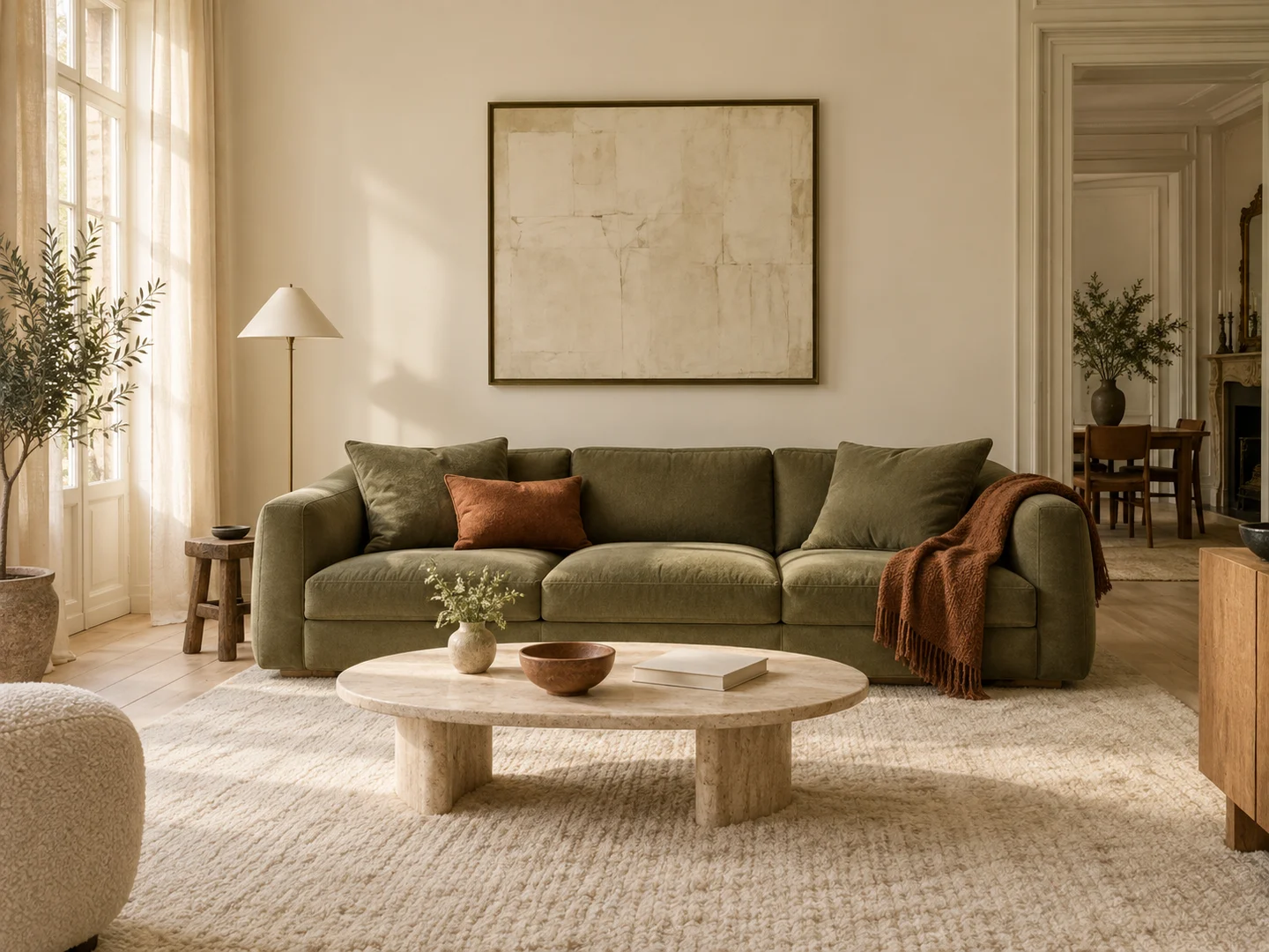
A broad stripe gives plain upholstery a stronger pattern and ties green to warmer accents.
Before you choose Check the selected Green Heather colourway and the care label. Wool may feel different from a soft synthetic fleece.
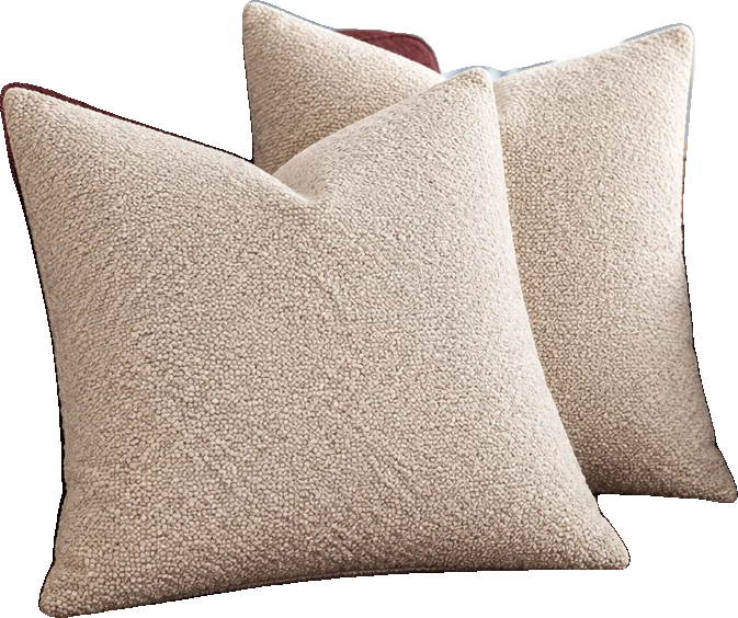
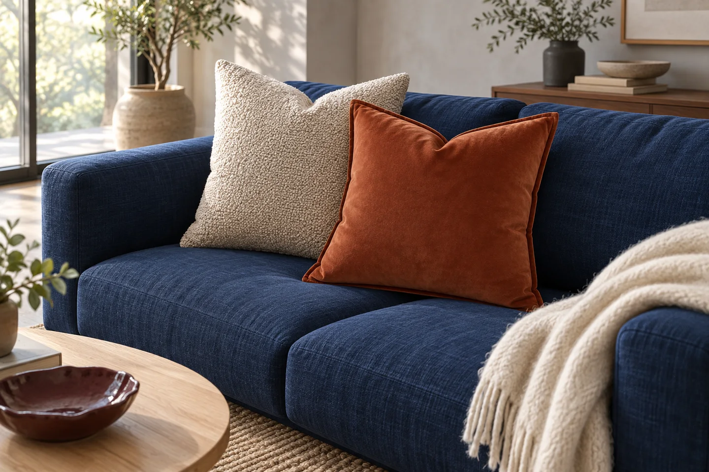
Beige / Natural Beige; 20 x 20 inches; pack of 2 covers, inserts not included
Beige bouclé adds texture while keeping the palette quiet beside a stronger print or colour.
Before you choose Covers only. Confirm the 20 × 20 in variant and the care instructions before ordering.
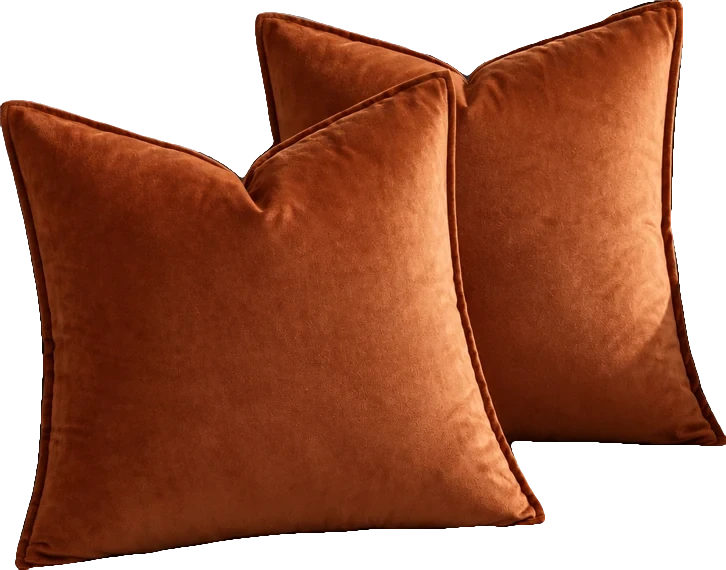
Rust; 18 x 18 inches; pack of 2 covers, inserts not included
Rust velvet brings a concentrated warm accent to grey, cream or dark upholstery.
Before you choose Covers only; check the pack contents and insert size on the selected listing.
Let one pattern lead
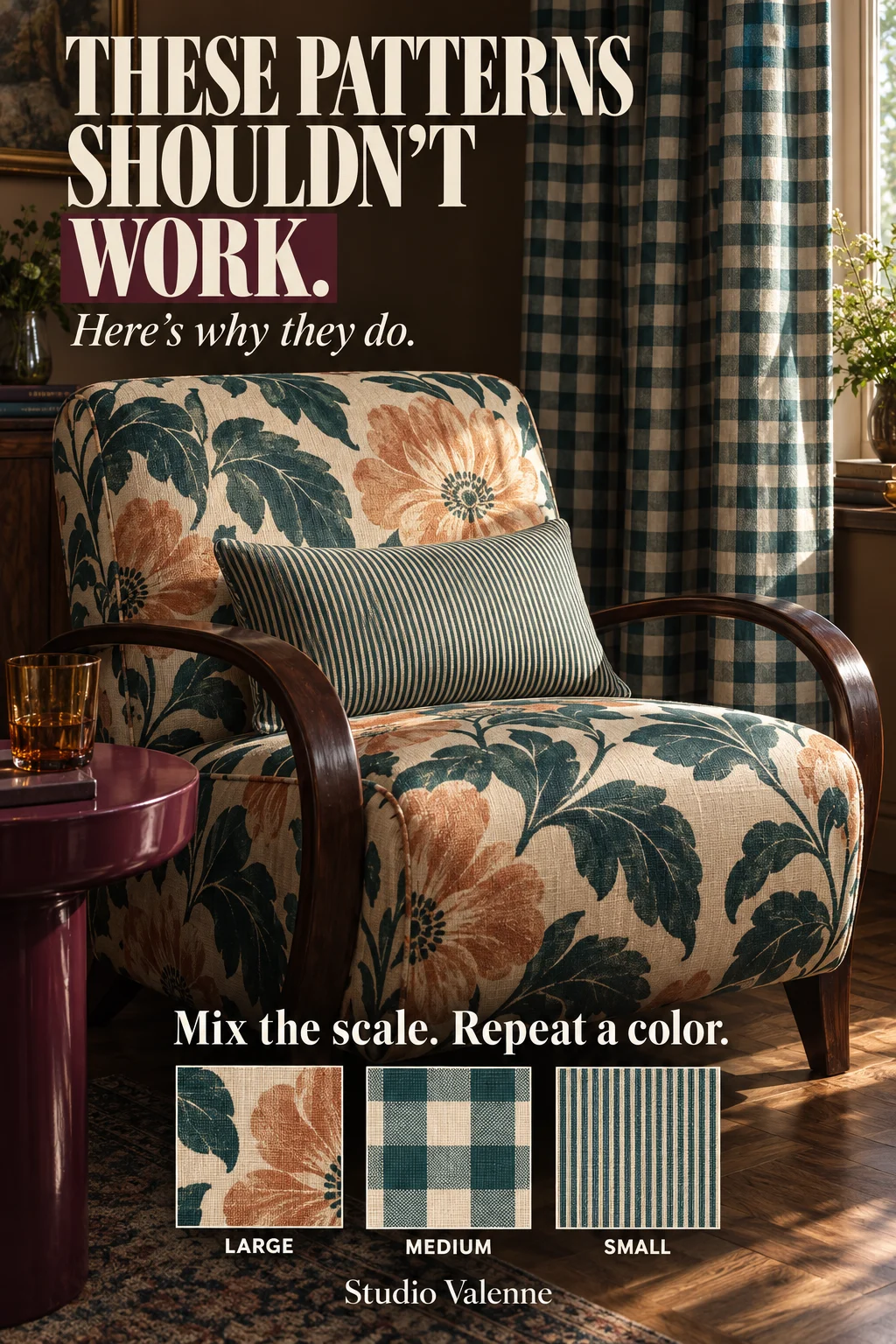
Choose the fabric you would most like to keep. In this example, the chair’s oversized floral is the starting point: broad leaves and apricot flowers are still easy to read from across the room. The check and stripe give it company without repeating the same shapes.
You can start with something you already own—a curtain, rug or cushion. Put the other samples beside that piece instead of selecting each print separately on a screen.
Compare the size of the motifs
The curtain has medium checks; the cushion has a much finer stripe. Each pattern is doing something different. Try laying equal-sized samples side by side so the small print is not enlarged to look as bold as the floral.
Large, medium and small is one helpful recipe, not a compulsory count. Similar-scale patterns can work too. If your first combination feels crowded, changing one motif’s scale is an easy experiment before abandoning the colors.
- Large floral + medium check + fine stripe.
- Broad stripe + smaller botanical + a plain woven fabric.
- One patterned rug + two quieter fabrics that repeat colors from it.
Repeat a color without matching every thread
Deep teal runs through all three textiles in the poster, while the floral adds apricot. That shared color gives you a reason to put the fabrics together. It does not require every background or shade to be identical.
Look at actual samples beside the furniture in daylight and after dark. A cream ground can feel much warmer beside a cool white one, and a color seen on a backlit screen may not match the delivered cloth.
Give the pattern somewhere to stop
The plain plum table and brown wall leave areas where the eye can rest. If every surface is busy, remove one patterned item temporarily and look again from the doorway. You may need fewer competing shapes rather than a new palette.
Finally, test the room in use. Open the curtains, sit in the chair and move the cushion into a comfortable position. Keep a mix that still looks good when it is being lived with.